.svg)
Welcome to the Spotter Brand Guidelines. Inside, you will find the foundational brand elements and visual principles for our partners, both internal and external. Need anything that's not here? Email brand_marketing@spotter.la.
Design guidelines
This covers everything from logo usage and color to typography and CTAs.
Logo usage guidelines
Clear space
Clear space is the minimum distance between the logo and other visual and verbal elements. The width of our “S” defines the minimum clear space surrounding the logo.
Color & minimum size
Co-branding
When pairing the Spotter logo with partner logos be sure each logo has the same visual weight. Providing ample clear space maintains the impact and importance of each logo. The spacing represented here is the minimum to use when pairing the Spotter logo, each co-partnership pairing should be addressed based on the partner logo. When possible, place Spotter in the primary position.
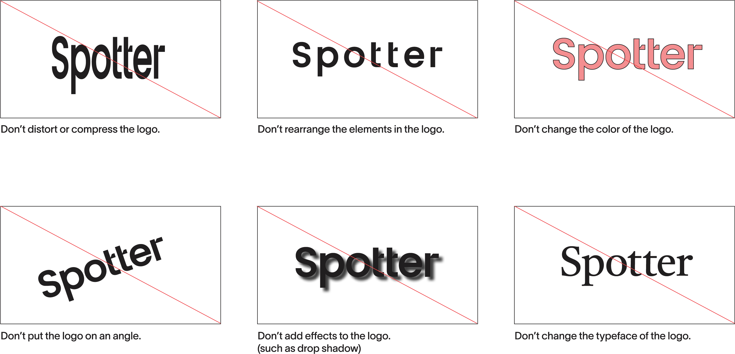
Logo misuse
As our logo is the most used and ownable asset, correct logo treatment is imperative. These are just a few of the ways the Spotter logo can be misused. Please always double check the logo use when creating new assets.
Color guidelines
Color accessibility
To make sure the Spotter messages are being clearly received and understood please make sure text is visible by following the ADA guidance on color pairings with typography.
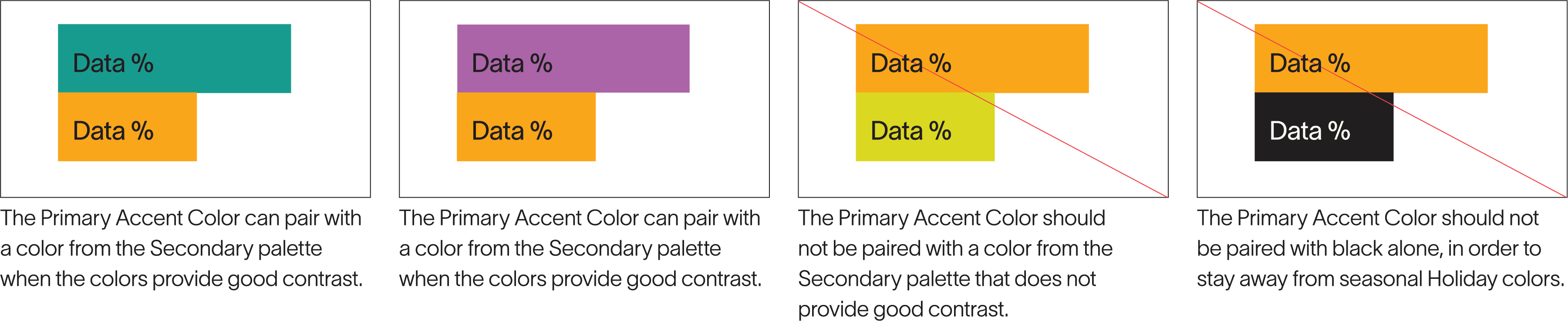
Color watchouts
In addition to ADA typography guidance, there are also a few things to cover from a color pairing perspective, as well as some aesthetic color choices in the Spotter visual system.
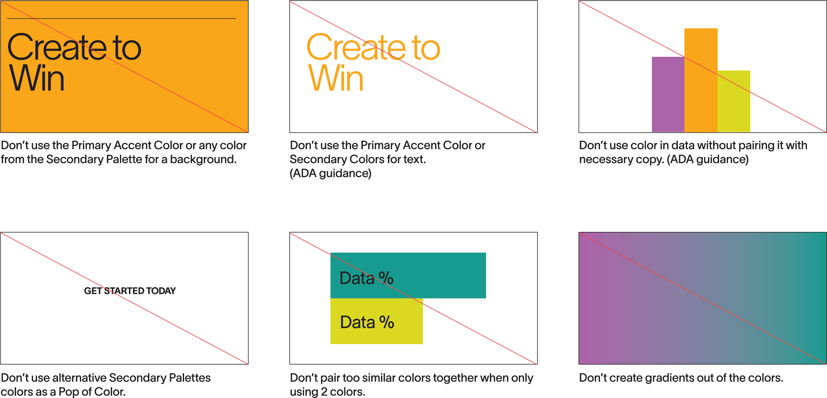
Color misuse
Our color palette should not be misinterpreted, modified, or added upon. No attempt should be made to alter the colors in any way. To illustrate this point, some of the more likely misuses are shown on this page.
Typography
Styling
The foundations for the Spotter typographic use and layout system are based in the Swiss International Style. This design style uses clear hierarchy, a minimal aesthetic, and modular designs that maximize scalability and consistency across various applications.
Principles
Text that is left aligned, with a ragged right edge create a clean and organized appearance while enhancing readability.
Asymmetry is used to create dynamic compositions. Paired with generous white space it creates a sense of openness and movement.
Use of a grid gives structure to layouts. The grid provides a consistent framework for organizing text and images, ensuring balance and order.
Primary headline

the Primary Headlines are set in medium to bold weight depending on the size of the text and the platform. This example is TWK LAUSANNE: 500
Leading is set very tight for the large headlines. Spacing between lines should be ⅔ or less of the cap height of the copy
Secondary headline

The Secondary Headlines are set in light weight depending on the size of the text and the platform. This example is TWK LAUSANNE: 150
Leading is set tight for the secondary headlines. Spacing between lines should be ¾ of the cap height of the copy.
Small header
MORE HEADLINES THIS WEEK (need file for 900 weight)
Small headers are set in extra bold weights depending on the size of the text and the platform. This example is TWK LAUSANNE: 900
Small headers are always ALL CAPS and are typically single lines.
Body copy

Small headers are set in extra bold weights depending on the size of the text and the platform. This example is TWK LAUSANNE: 900
Small headers are always ALL CAPS and are typically single lines.
Headline pairing examples
Get an inside look into how Creators are captivating audiences firsthand, with insights from today's industry leaders and visionaries.
We provide state of the art resources to the world's top YouTube Creators.
Ready to amplify your channel's success?
Our AI software is here to supercharge your content creation journey. Don't miss on this opportunity to revolutionlize your channel.
Typography misuse
The Spotter typography system is very flexible, but that does not mean anything goes. See here for the most common misuse examples.

Image container rules
Pairing
When grouping image containers with copy or next to each other, be aware of how the shapes and edges relate. Aligning copy to the square corners of the frame makes a trustworthy and modern structure.
Color misuse
Our color palette should not be misinterpreted, modified, or added upon. No attempt should be made to alter the colors in any way. To illustrate this point, some of the more likely misuses are shown on this page.
A single paragraph of body copy aligned to the bottom left corner of the image and placed to the left
A small header and caption aligned to the bottom left corner of the image and placed below

In instances when the image is larger or singular in the layout, copy can be aligned to the middle of the crop angle for a bolder, more dynamic effect.
When arranging multiple pieces of media, ensure image containers use the same crop angle on the corners near each other so those edges relate seamlessly. Be mindful of how the shapes interact. Close pairings should always use the same angle on the adjacent corners to maintain visual consistency.

Layout
When grouping image containers with copy or next to each other, be aware of how the shapes and edges relate. Aligning copy to the square corners of the frame makes a trustworthy and modern structure.
Bulleted lists with small call outs give additional importance to the information. Shorter lines of body copy make it easier to read and process.

Dividing information into sections reduces information fatigue and creates a more appealing layout visually.

An editorial layout with a large image and headline is made more interesting by tucking the bulleted list under the crop of the image.
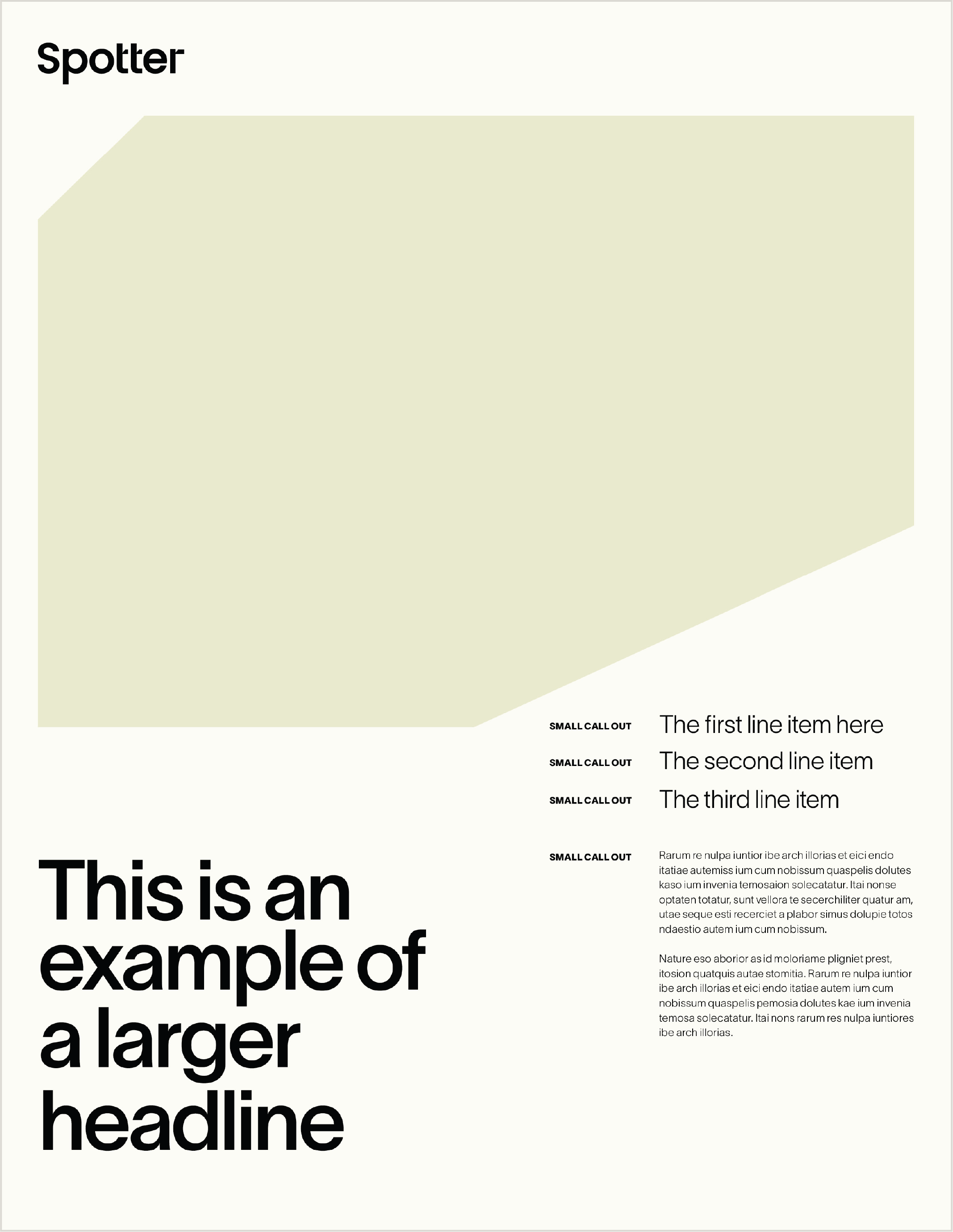
A variation of the same layout is created by a slight adjustment to line lengths of the copy and creating a header section with a line rule.

CTAs
The CTA buttons are a clear signal for users to learn more about and further engage with Spotter. Consistency of the buttons across all forms of communication creates a smoother experience.
Outline solutions

Solid solutions

The CTA buttons are a clear signal for users to learn more about and further engage with Spotter. Consistency of the buttons across all forms of communication creates a smoother experience.
Hyper links

Hyperlinks are set in bold weights depending on the size of the text and the platform. This example is TWK LAUSANNE: 700 Arrow weight should match the text weight and be 3x M-spaces
Line rules
Line rules are a crucial graphic device in the Spotter visual system. They are used to highlight important information and create divisions in long layouts, both of which provide a hierarchical structure at a glance.
Header examples
Typically found at the start of a longer layout or as a part of a multiple page application, the header rule securely locks in the consistent information needed for ease of navigation.


Information divider examples
Divider rules can either break up information into more digestible sections or be grouped with important information pieces to make them more prominent in the layout.

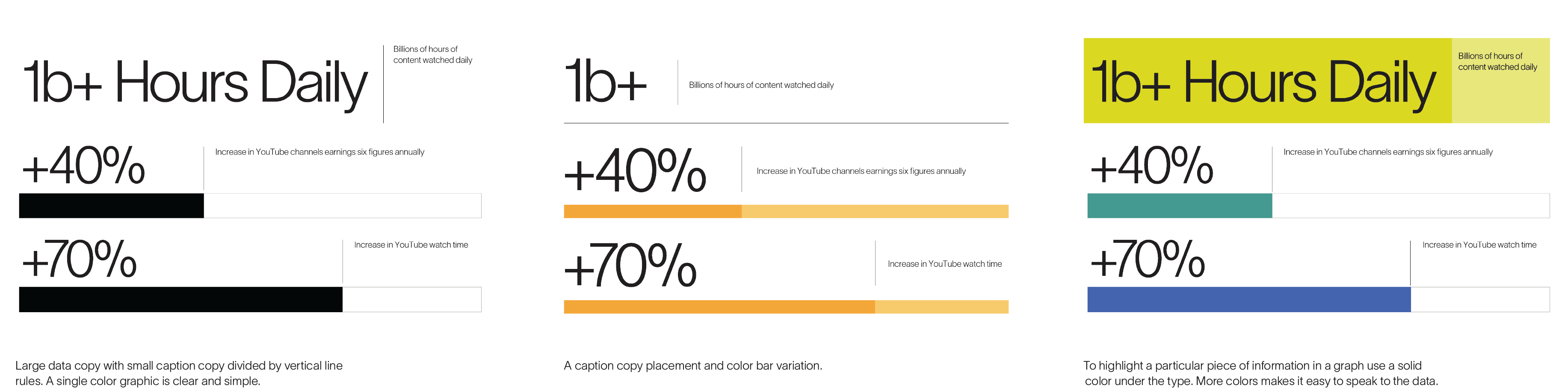
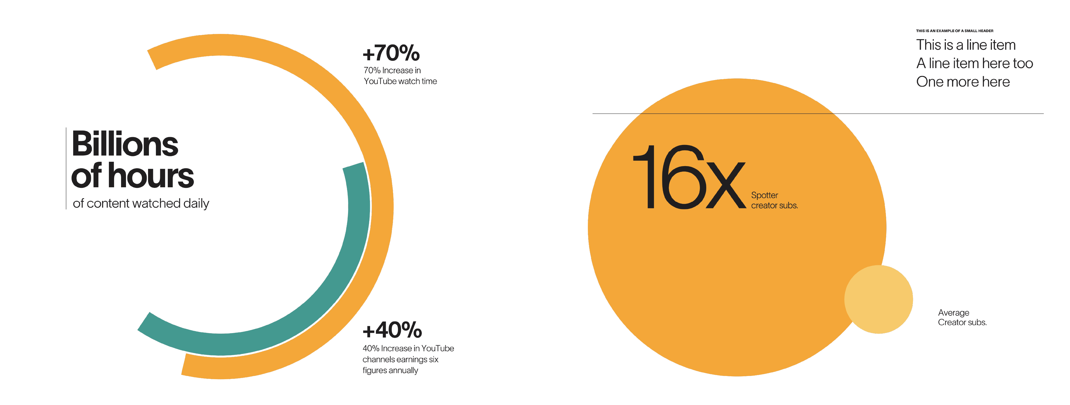
Data visualization
Spotter data visualizations utilize line rules, dynamic typography, and color bars to create straightforward and easily understood visual representations of data.The Spotter visual system is a also great foundation for geometric data visualization. Rules from the typographic style and simple graphics combine to create bold and easily understood information graphics